Pharmacy Label Safety Checker
Check Your Medication Safety
Select your medication type and warning sticker to understand what it means
Every time you pick up a prescription, there’s a small piece of paper stuck to the bottle that could save your life. It’s not just a reminder to take your pills - it’s a safety net. But if you’ve ever stared at a pharmacy label wondering what the tiny print actually means, you’re not alone. Many people miss critical warnings because the labels are cluttered, hard to read, or inconsistent from one pharmacy to the next.
What’s Really on Your Prescription Label?
Your prescription label isn’t just a suggestion. It’s a legal document. Under federal rules, every label must include your name, the drug name, dosage instructions, and the pharmacy’s contact info. But that’s just the baseline. The real safety info - the stuff that keeps you from mixing up medications or overdosing - often hides in fine print or gets added as a separate sticker.
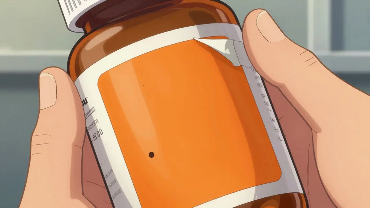
For example, if you’re prescribed an opioid, you might see a bright orange warning sticker on the bottle. That’s not random. Since January 1, 2024, Connecticut law requires all opioid prescriptions to have a fluorescent orange label that’s exactly 1.25 inches in diameter. It’s designed to catch your eye. The text? Something like: CAUTION: OPIOID - Risk of Overdose and Addiction. These aren’t just nice-to-haves. They’re responses to real harm.
One study found that 12% of medication errors in community pharmacies happened because similar-looking labels confused patients. Someone took their blood pressure pill thinking it was their diabetes medicine. Another person took double the dose because the tiny font made “once daily” look like “twice daily.” These aren’t hypothetical risks. They’re daily occurrences.
Why the Labels Are Changing - and Fast
The FDA is pushing for a major overhaul. By January 1, 2025, all U.S. pharmacies will need to follow a new standard called the Patient Medication Information (PMI) rule. This isn’t just a tweak. It’s a complete redesign. Instead of scattered notes and tiny fonts, the new labels will have one clear, single-page format. It’ll group essential info like this:
- What this medicine is for - in plain language, not medical jargon
- How to take it - with clear times (e.g., “Take with breakfast”) and warnings like “Do not drink alcohol”
- What to watch for - common side effects, red flags, and when to call your doctor
- What to avoid - other drugs, foods, or activities that could be dangerous
This change comes because older adults - who often take five or more prescriptions - are at highest risk. A 2023 AARP survey found that 68% of people over 65 struggled to read their current labels. Font sizes were too small. Colors didn’t contrast enough. Some labels used serif fonts, which are harder to read for people with vision issues.
The new rules fix that. Minimum font size for warnings is now 8-point. All text must be in sans-serif fonts like Arial or Helvetica. Text must have at least a 4.5:1 contrast ratio against the background. That means black on white? Perfect. Light gray on off-white? Not allowed.
Barcodes, QR Codes, and Tech You Can’t Ignore
Behind the scenes, your label has a hidden layer. Every prescription bottle now has a barcode - usually a GS1 DataMatrix code. It’s not just for scanning at the register. It holds your drug’s National Drug Code (NDC), lot number, and expiration date. Pharmacy systems scan this barcode to make sure you’re getting the right pill, the right dose, and the right bottle. If the barcode doesn’t match the prescription, the system flags it before you leave.
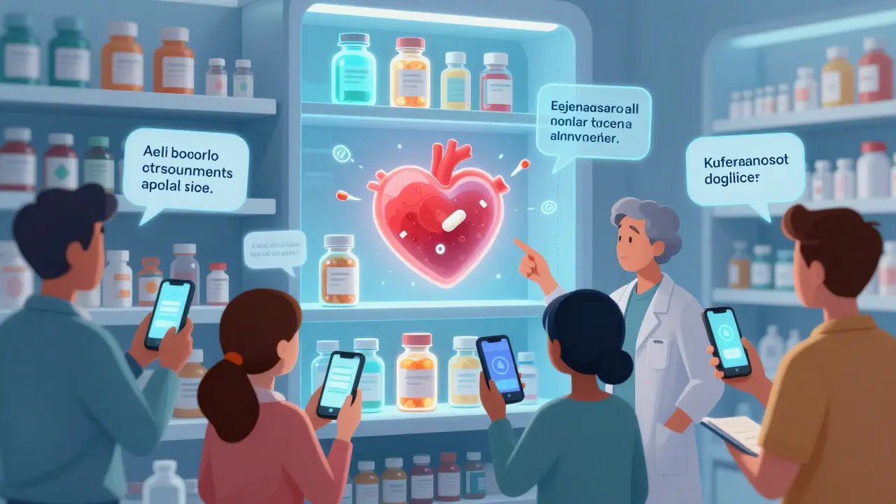
Some pharmacies are already adding QR codes. Scan it with your phone, and you’ll get a short video showing how to take the medicine, what side effects to expect, or even how to use an inhaler correctly. In March 2024, 18% of prescriptions in the U.S. included QR codes. That number is climbing fast.
And it’s not just convenience. For people with low health literacy or limited English, these videos are life-changing. California’s Board of Pharmacy found that 47% of patients with limited English proficiency didn’t understand their current labels. Now, they’re required to offer translated instructions - and video guides - in Spanish, Mandarin, Vietnamese, and more.
Warning Stickers: What the Colors Mean
Not all warning stickers are the same. Color matters. Here’s what you’re likely to see:
- Fluorescent orange - Mandated in Connecticut and growing in other states. Used for opioids and controlled substances. High visibility. Hard to miss.
- Red with white text - Common for serious risks like “Risk of Liver Damage” or “May Cause Drowsiness.” Often used for drugs with boxed warnings from the FDA.
- Yellow - Used for moderate warnings, like “May interact with alcohol” or “Take with food.”
- Green - Usually for reminders, like “Take daily at bedtime” or “Do not stop suddenly.”
These colors aren’t random. They’re based on safety research. Orange and red trigger an automatic alert in the brain. Yellow signals caution. Green is calming. Pharmacies use them to match the level of risk.
Companies like PDC Healthcare sell these stickers in bulk - 500 per roll, with red-on-white text on permanent adhesive. A single pharmacy might go through 20,000 warning stickers a year. That’s how big this issue is.
What You Should Do Right Now
You don’t have to wait for the new labels to start reading them better. Here’s what to do every time you get a new prescription:
- Check the name - Is it spelled right? Is it the drug your doctor prescribed? Mistakes happen. One patient took a diabetes drug called Glipizide thinking it was Glimepiride - two similar names, different effects.
- Read the dosage - Does it say “Take one tablet by mouth once daily”? Or does it say “Take one tablet by mouth”? That’s not enough. You need frequency.
- Look for stickers - Don’t ignore them. If there’s a bright orange or red sticker, read it twice. It’s there for a reason.
- Ask about interactions - “Can I take this with my other meds?” “Is it safe with alcohol?” “Will this make me dizzy?” Don’t assume the pharmacist knows you’re on five other drugs.
- Use your phone - If there’s a QR code, scan it. If not, search the drug name + “FDA patient guide.” You’ll find official, plain-language summaries.
Why This Matters More Than You Think
Medication errors are the third leading cause of death in the U.S. - ahead of car accidents and diabetes. Most of them happen because of poor labeling. The good news? Standardized labels could cut those errors by up to 30%, according to pilot studies from 15 pharmacies across seven states.
Small pharmacies are worried about the cost. Upgrading software, buying new printers, training staff - it can run $5,000 to $15,000. But the cost of a mistake? A hospital stay. A fall. A death. That’s why the FDA, USP, and state boards are pushing hard for change.
This isn’t about bureaucracy. It’s about making sure the person taking the pill - you - can actually understand it. No matter your age. No matter your English skills. No matter how many pills you take.
By 2027, 75% of labels may include augmented reality features - think pointing your phone at the bottle and seeing a 3D animation of how the drug works in your body. It sounds futuristic. But it’s coming. And it’s not just for tech lovers. It’s for your grandmother. For your uncle with diabetes. For you, when you’re tired, stressed, or overwhelmed.
The goal isn’t perfect labels. It’s safe ones. Ones you can read. Ones you can trust.
Why do some pharmacy labels look different from others?
Before the FDA’s new Patient Medication Information rule takes effect in 2025, there’s no national standard. Each state and pharmacy chain can design labels differently. Some use small fonts, others add extra stickers. That’s why one pharmacy might have a clear label and another uses tiny text and confusing symbols. The new rule will fix this by requiring all labels to follow the same format nationwide.
What does a fluorescent orange sticker mean?
A fluorescent orange sticker is required in Connecticut and is being adopted by other states for opioid prescriptions. It signals a high-risk medication with serious dangers like addiction or overdose. The color is chosen because it’s impossible to ignore - even for people with poor vision. It’s not a suggestion. It’s a legal warning.
Can I ignore a warning sticker if I’ve taken the medicine before?
No. Warning stickers are updated based on new research or changes in your health. Even if you’ve taken the same drug before, your body may have changed - maybe you’re older, taking a new supplement, or have a new health condition. Always read every sticker. The same drug can have different warnings depending on your situation.
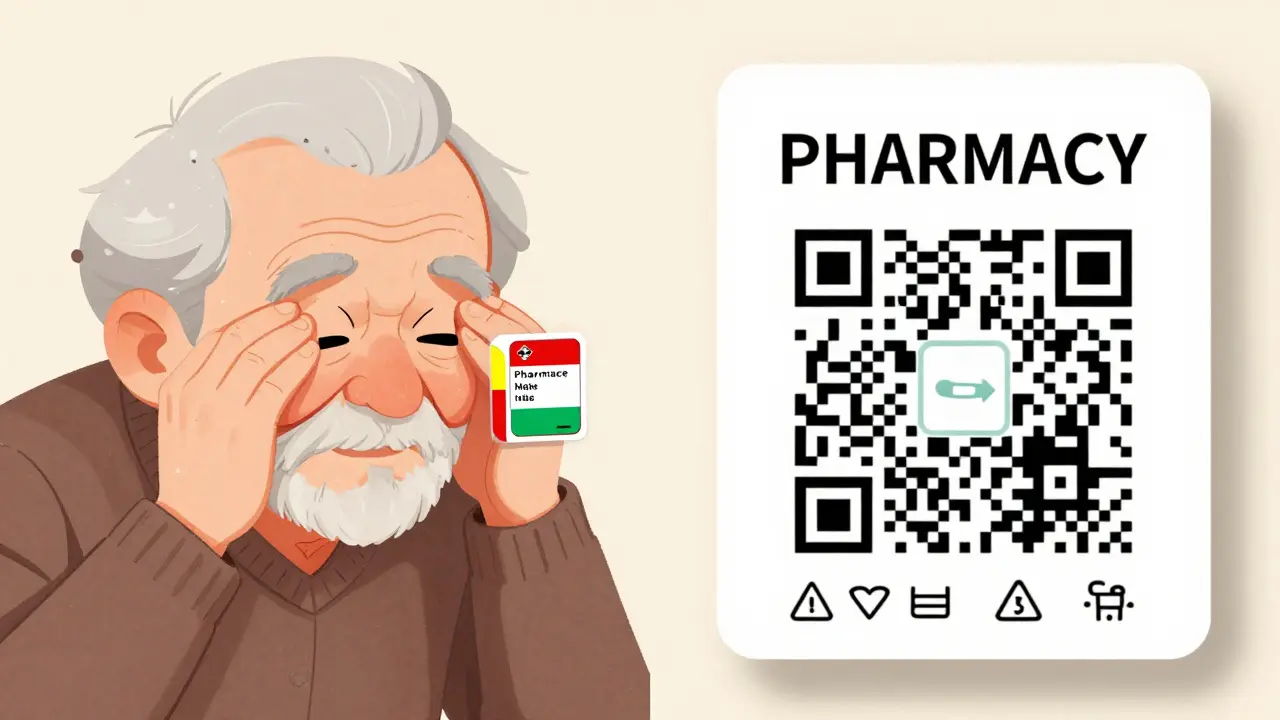
What if I can’t read the label because the font is too small?
Ask your pharmacist for a large-print copy. Under new FDA guidelines, pharmacies must provide this if requested. You can also ask for a translated version if English isn’t your first language. Many pharmacies now offer QR codes that link to audio or video instructions - just scan with your phone. No need to squint.
Are pharmacy labels the same in every state?
No. While federal rules require basic info like your name and dosage, states can add their own rules. For example, Connecticut requires orange opioid warnings. California requires multilingual labels. New York has rules about spacing and font size. By 2025, the FDA’s new PMI rule will make all labels the same across the country.
What should I do if I think my label is wrong?
Don’t take the medicine. Call the pharmacy immediately. Ask them to double-check the prescription with your doctor. If they dismiss your concern, ask to speak to the pharmacist on duty. You have the right to safe, accurate medication. If needed, contact your state board of pharmacy - they investigate labeling errors. Better safe than sorry.

OMG I JUST REALIZED I’VE BEEN IGNORING THOSE STICKERS FOR YEARS!!! 😱 Like, I took my opioid stuff and never even READ the orange one-thought it was just marketing. I’m so glad I saw this. Going back to check ALL my bottles right now. THANK YOU!! 🙏
Ah yes, the great pharmaceutical circus. Where your life depends on whether the printer ink is still wet or if someone forgot to update the sticker template. Meanwhile, the FDA is still arguing over whether 'once daily' should be capitalized. Classic.
This is so important. I had a friend who混了 meds because the labels looked too similar. She ended up in the ER. Please, please read the stickers. Even if you think you know what you’re taking. It’s not worth the risk.
Let’s be real-this whole 'standardized label' thing is just corporate theater. The real issue? Pharma companies don’t want you understanding your own meds. They want you confused, compliant, and buying refills. QR codes? More data collection. 'Patient safety'? Marketing buzzwords with a side of profit margin.
The FDA’s new PMI rule is long overdue. Font size, contrast ratios, sans-serif typefaces-these aren’t luxuries. They’re basic accessibility. Anyone who dismisses this as bureaucratic overreach hasn’t tried reading a label at 2 a.m. with tired eyes.
You think this is about safety? Think again. The real agenda is surveillance. Every QR code scans your phone, your location, your habits. The government and Big Pharma are building a database of who takes what, when, and how often. This isn’t healthcare. It’s control.
Orange sticker? Cute. But you know what’s scarier? The fact that your pharmacist still doesn’t know what your other 7 meds are. This is all just distraction. Fix the system, not the label.
I’ve been taking this medicine for 12 years… and now they’re changing the label?!! What if they switch the dosage next?? What if they put a QR code that tracks my heart rate?? I’m terrified… I don’t trust ANY of them… I’m not taking it until I get a handwritten note from my doctor… on paper… with a stamp…
Look, I get it. But you know what’s more dangerous than bad labels? People who think scanning a QR code is the same as talking to a pharmacist. I’ve seen folks trust a 30-second video more than their own doctor. That’s not safety. That’s laziness with Wi-Fi.
whatever. labels. stickers. qr codes. i dont care. i just take the pill. if i die, i die. its fine.
This made me cry a little 😭 My grandma couldn’t read her labels and ended up taking double her dose. I’m so glad things are changing. If you’ve got a parent or elder taking meds-help them scan the QR codes. Or even just read it out loud. Small things save lives. 💙
The new labeling system is a step forward. However, one must consider the cultural context. In India, for example, 60% of patients rely on family members to interpret labels. Technology is helpful, but human connection remains irreplaceable. 🙏📱